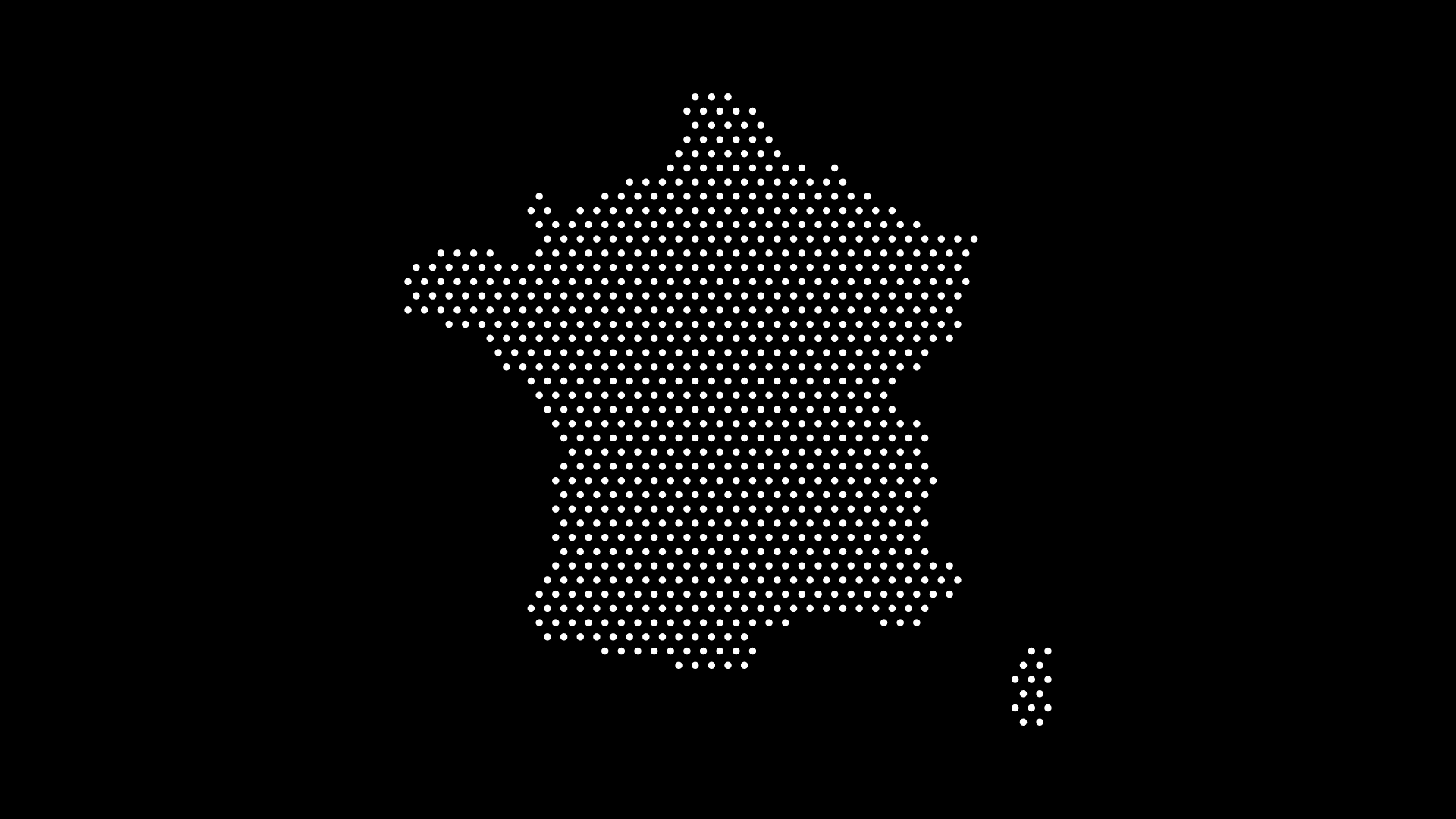
Dot Map Examples for Data Visualization and Design

A dot map is a simple idea with huge range: use dots to show location, density, or pattern. The result can be analytical (revealing distributions) or artistic (minimalist, modern decor). This post rounds up real-world dot map examples you can adapt for dashboards, posters, lesson plans, and landing pages—plus quick steps to make your own with World in Dots.
What Makes Dot Maps So Effective?
- Instant pattern recognition — clusters, gaps, corridors pop out.
- Scale-agnostic — works from phone screens to wall posters.
- Style control — density, dot size, spacing, and color tweak readability and tone.
- Data or design — equally at home in reports and brand visuals.
Data Visualization: Dot Map Examples You Can Recreate
1) Population & Urbanization
Show how people concentrate along coasts and corridors.
Variant: 1 dot = 50k people; increase density around metros for fidelity.
2) Public Health Access
Place dots for clinics or pharmacies; color by service type.
Use case: Site planning and service gaps for local governments.
3) Climate & Environment
Map wildfire points, rainfall gauges, or protected areas as dots.
Tip: Vary dot opacity to avoid overplotting in dense regions.
4) Mobility & Transport
Plot transit stations, bikeshare docks, or EV chargers.
Insight: Corridor visibility helps identify underserved zones.
5) Retail Footprint
Locations as dots; intensity by store category or sales tier.
MOFU asset: Great for investor or stakeholder updates.
6) Elections & Civic Data
Precinct locations or ballot drop sites as dots with category color.
Benefit: Avoids the “big rural polygon” bias of choropleths.
7) Education & Research
Universities, research labs, or student origins as dot distributions.
Classroom: Use a one-to-many scheme (e.g., 1 dot = 1,000 students).
8) Tourism & Events
Attractions, venues, or festival points; cluster-aware labeling.
Design twist: Use brand accent color for featured venues.
9) Supply Chain & Logistics
Ports, warehouses, routes (as dotted paths).
Outcome: Visualizes network resilience and regional exposure.
10) Humanitarian Response
Shelters, aid distribution, incident reports as time-animated dots.
Technique: Encode recency via size or lightness.
Design & Creative: Examples Beyond Pure Data
1) Minimalist World Poster
Uniform dots forming continents—clean, timeless wall art.
2) Brand Hero Graphic
Dotted globe with one region in accent color to signal presence.
3) Editorial Illustration
Dot pattern underlays for geography-themed magazine spreads.
4) Product UI Elements
Micro-dot world used as a non-distracting background in dashboards.
5) Event/Conference Visuals
Dotted host-country silhouette on badges, slides, and banners.
6) Classroom Decor
Country or continent dot posters with simple labels and color coding.
7) Landing Page Social Proof
Dotted world + tooltips: “Customers in 72 countries.”
8) Album/Poster Art
Abstract dotscapes suggesting a city or coastline—great for prints.
9) Travel Tracker
Interactive personal map: visited countries as filled dots, wishlist as outlines.
10) Data-as-Art Prints
Use data-driven placement but restrict to two colors for gallery-ready pieces.
Quick Case Concepts (Swipe These)
- Population contrast: Two dot densities side-by-side (night vs. day workers).
- Before/After: Pre- and post-policy service locations as overlays.
- Progress tracker: Quarterly growth of retail sites in cumulative dots.
- Focus spotlight: Global dots desaturated; target region in bold color.
How to Create Dot Maps in Seconds (No GIS Needed)
With World in Dots, you can generate dotted vectors fast—ready for Figma, Illustrator, or the web.
- Select Region — World, continent, or a specific country.
- Choose Dot Style — Uniform grid for minimalist; higher density for detail.
- Customize — Dot size, spacing, color, margins/crop for print or slides.
- Export — SVG for editing/embedding, or high-res for posters.
Data overlay option: Export the dotted base map, then layer your points (from CSV/GeoJSON) in your design tool or app for full control.
Example: Dotted World Map

This dotted world works as a neutral base for:
- KPI overlays in dashboards
- Classroom handouts
- Hero images on landing pages
- Poster series with region highlights
Styling Tips for Readable, Beautiful Dot Maps
- Density ≈ viewing distance — posters can handle denser dots; UI needs sparser.
- Contrast first — keep dots and background clearly separated.
- One accent color — highlight a region or category without visual noise.
- Whitespace matters — add generous padding to avoid cramped edges.
- Label lightly — few, purposeful labels keep the dot rhythm intact.
- Accessibility — ensure color choices pass contrast checks; don’t rely on color alone.
Export & Workflow Cheatsheet
- SVG — best for web, Figma/Illustrator edits, and small file size.
- PDF/AI — print workflows and prepress.
- PNG — quick mockups or social previews (export from your vector).
Final Thoughts
Dot maps bridge information and aesthetics: they reveal patterns while staying elegant. Whether you’re visualizing data or crafting brand visuals, the same technique adapts with a few parameter tweaks.
With World in Dots, you can go from idea to editable vector in minutes—then refine in your favorite tool or ship straight to the web.
Explore, customize, export—one dot at a time.