How to Make a Choropleth Map (and When to Use Dots Instead)
A choropleth map shades each region by a value — darker for higher, lighter for lower. It's the most common style of data map, and for the right kind of data it works beautifully. But it isn't always the best choice, and knowing when to reach for dots instead will make your visualizations far more honest.
This guide explains how to make a choropleth map, where it shines, and when a dot map from World in Dots tells the story better.
What Is a Choropleth Map?
A choropleth map colors predefined regions (countries, states, counties) according to a data value — for example, GDP per capita or vaccination rate. The shade encodes the number, and a legend explains the scale.
It's ideal for rates and ratios that are already normalized by area or population.
How to Make a Choropleth Map
Step 1: Normalize Your Data
Use rates, not raw counts (e.g. "cases per 100,000," not total cases). Raw counts on a choropleth mislead, because bigger or more populous regions look extreme by default.
Step 2: Choose a Color Scale
- Sequential for low-to-high values
- Diverging for data with a meaningful midpoint
- Keep it colorblind-friendly and limit the number of shades
Step 3: Map Regions to Values
Assign each region its color based on the scale, and always include a clear legend.
When to Use Dots Instead
The classic weakness of a choropleth map is the area bias: a huge, sparsely populated region dominates the picture even if few people live there. Use a dot map when:
- You're showing raw counts (population, customers, events)
- Where things are concentrated matters more than a regional average
- Large empty areas would otherwise distort the message
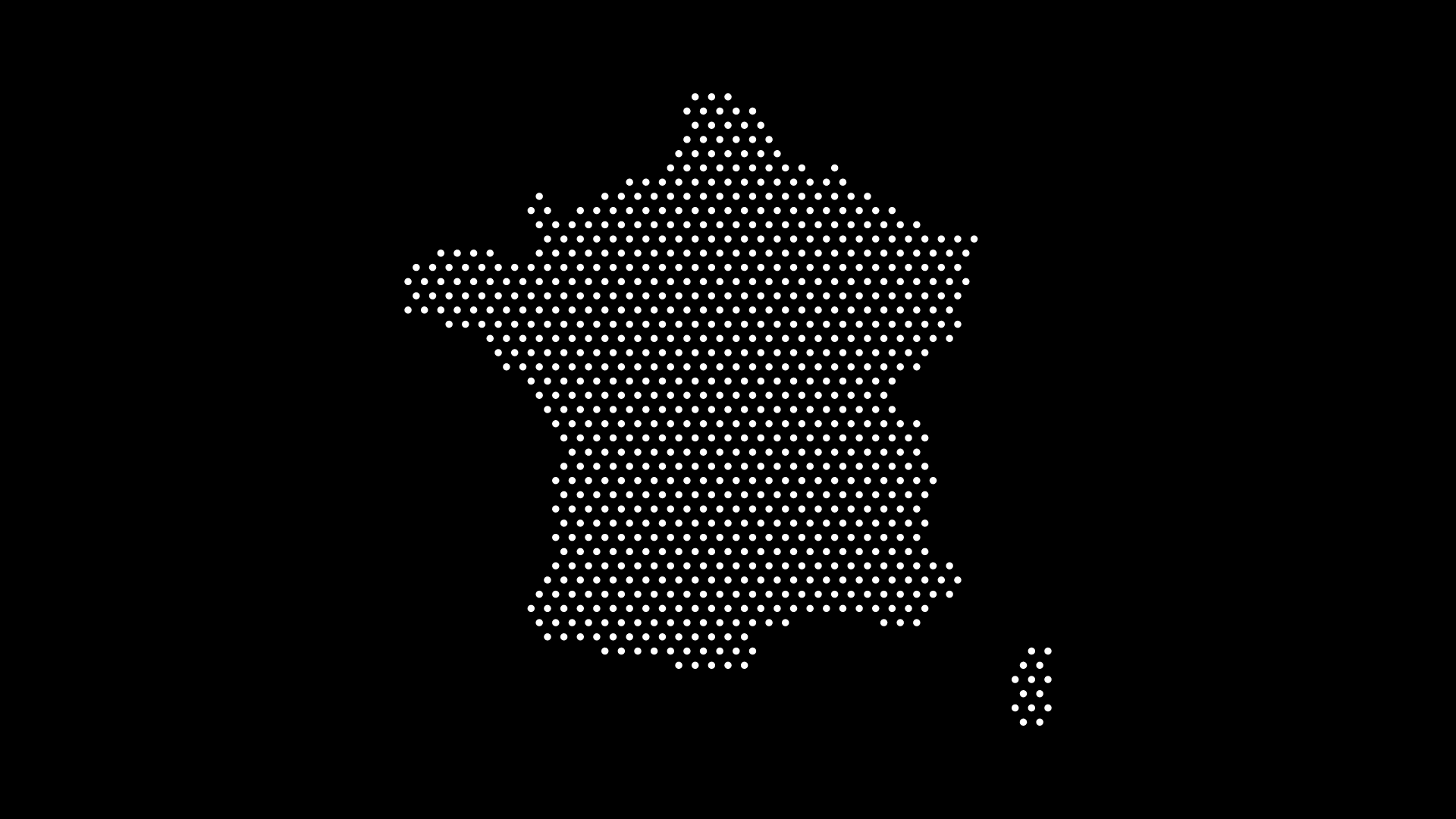
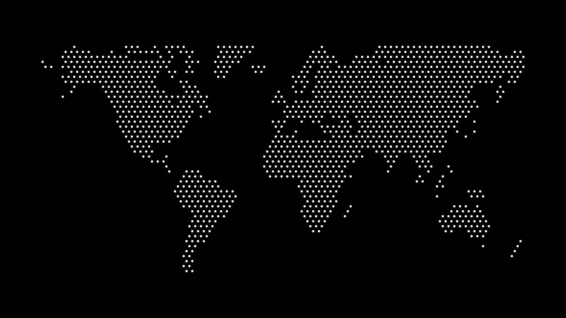
A dot density map places dots proportional to quantity, so cities and clusters read accurately.
Quick Decision Guide
- Rate or ratio, normalized? → Choropleth
- Raw count or concentration? → Dot map
- Want a clean, minimal look? → Dot map
Final Thoughts
A choropleth map is the right tool for normalized rates — but for raw counts and concentration, a dot map is clearer and more honest. With World in Dots, you can build a clean dot map in minutes and avoid the area-bias trap entirely.
Try World in Dots today and choose the map style that actually fits your data.