How to Make a Dot Density Map Without GIS Software

A dot density map is one of the most effective ways to visualize how something is distributed across a geographic area. Traditionally, making these maps required GIS software (like ArcGIS or QGIS) and complex datasets — but today, anyone can create one quickly and easily online.
In this guide, we’ll explain what a dot density map is, why it’s useful, and how you can make your own without GIS software using modern, user-friendly tools like World in Dots.
What is a Dot Density Map?
A dot density map uses dots to represent a quantity of data in geographic space. Each dot corresponds to a number of items (like 1,000 people, or 10 factories), and the placement of dots shows patterns and concentrations.
Examples of what dot density maps can represent:
- Population density
- Agricultural production
- Business locations
- Environmental events (e.g., wildfire spots, rainfall points)
Unlike choropleth maps (which shade entire regions), dot density maps highlight distribution inside the region, giving a more detailed impression.
Why Avoid GIS Software?
While GIS tools are powerful, they can be:
- Complex: Steep learning curve for beginners.
- Time-Consuming: Requires data cleaning, layers, and formatting.
- Costly: Many professional GIS platforms require paid licenses.
If your goal is simple, clean visuals for reports, posters, or teaching, a lightweight map generator is often the faster solution.
How to Make a Dot Density Map Without GIS
Here’s how you can build one in minutes with World in Dots:
Step 1: Choose Your Region
Select the world, a continent, or a specific country.
Step 2: Adjust Dot Style
- Define dot size and spacing
- Increase or reduce density for clarity
- Choose whether dots follow an outline or fill the area evenly
Step 3: Customize Appearance
- Apply colors that match your project
- Highlight regions for emphasis
- Export for web or print
Step 4: Export Your Map
Download as an SVG vector (editable in Illustrator/Figma) or a high-res image for reports and posters.
Example: Dot Density World Map
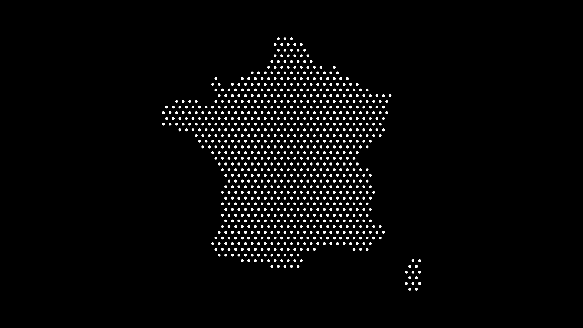
This example shows a dotted density world map generated instantly. With a few adjustments, the same map could highlight:
- Population clusters
- Climate data
- Business coverage
Practical Uses
- Education: Teaching geography or statistics with engaging visuals.
- Data Visualization: Presenting demographic or environmental data.
- Design & Branding: Minimalist dot maps for posters, decks, and infographics.
- Research & Reports: Visualizing findings without needing advanced GIS.
Final Thoughts
You don’t need GIS software to create compelling dot density maps. With tools like World in Dots, anyone — from designers to educators — can generate custom dot maps in seconds.
Fast, scalable, and customizable, these maps are perfect for data storytelling, design projects, and modern education.
Try World in Dots today and create your first dot density map without the complexity of GIS.