How to Make a Population Density Dot Map

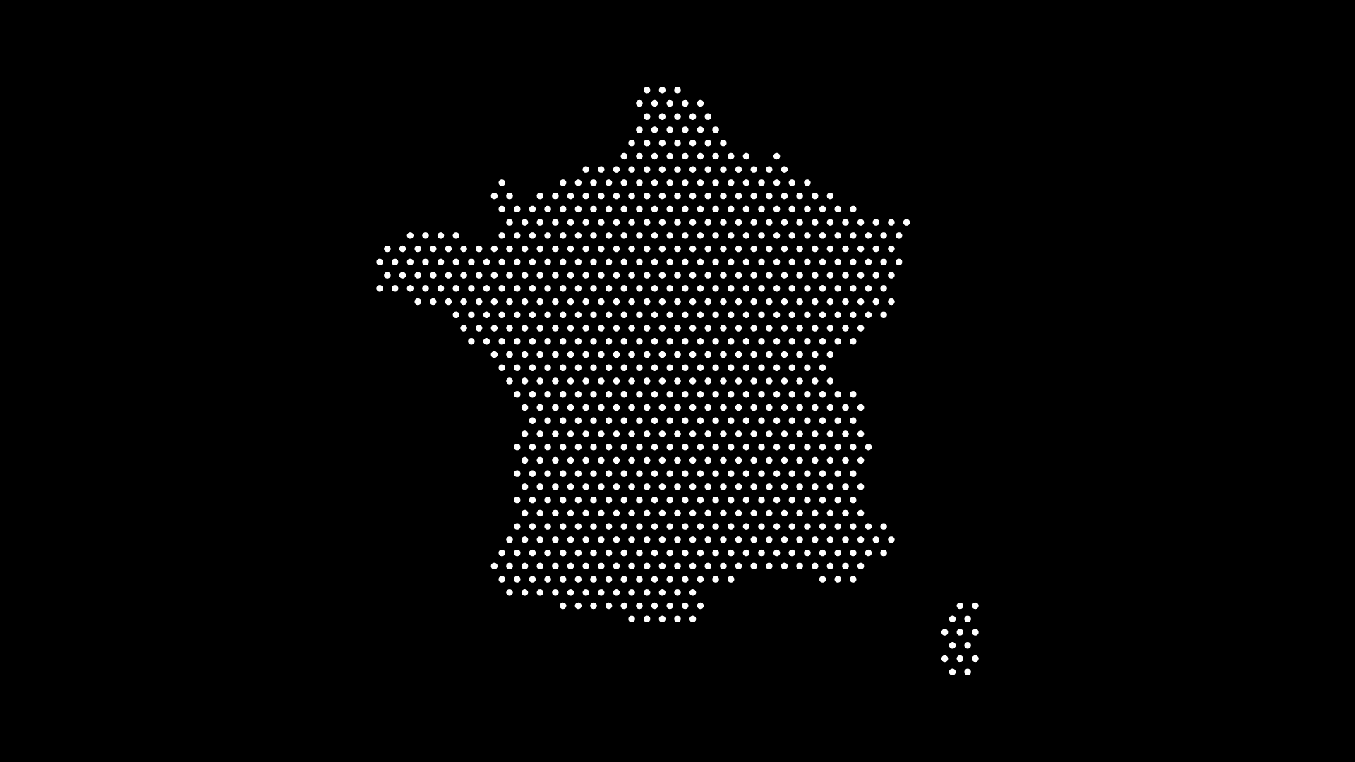
A population density dot map is one of the clearest ways to show where people actually live. Instead of shading whole countries a single color, each dot represents a number of people — so clusters and empty spaces tell the real story at a glance.
In this guide, we'll explain how a population density dot map works and how to create one without wrestling with GIS software, using World in Dots.
What Is a Population Density Dot Map?
In a dot density map, each dot stands for a fixed quantity — say, 100,000 people. Where population is concentrated, dots cluster together; where it's sparse, they spread out. The result shows distribution inside a region, not just an average across it.
This is why dot maps often communicate population better than choropleth (shaded-region) maps: a large country shaded one color hides the fact that most people live in a few cities.
Why Use Dots Instead of Shaded Regions
- Shows concentration — coastal and urban clusters become obvious
- Avoids the "big area" bias — large, empty regions don't dominate
- Reads quickly — patterns emerge without needing a legend
- Looks clean — minimal styling fits reports, decks, and infographics
How to Make One Without GIS
Step 1: Choose Your Region
Select the world, a continent, or a specific country to focus on.
Step 2: Set Dot Density
- Increase dot density where you want to emphasize population
- Adjust dot size and spacing so clusters stay readable
- Keep the style minimal so the pattern does the talking
Step 3: Highlight and Export
Emphasize key regions with color, then export as an SVG (editable in Illustrator or Figma) or a high-resolution image for print.
Where Population Dot Maps Are Used
- Education — teaching demographics and urbanization
- Reports & journalism — illustrating where people live
- Business — showing market size by population
- Presentations — a clean visual that needs no explanation
Final Thoughts
You don't need ArcGIS or QGIS to build a compelling population density dot map. With World in Dots, you can generate a clean, customizable version in minutes and export it for web or print.
Try World in Dots today and map out where the world's population really lives.