Using a Dotted Map SVG as a CSS Mask
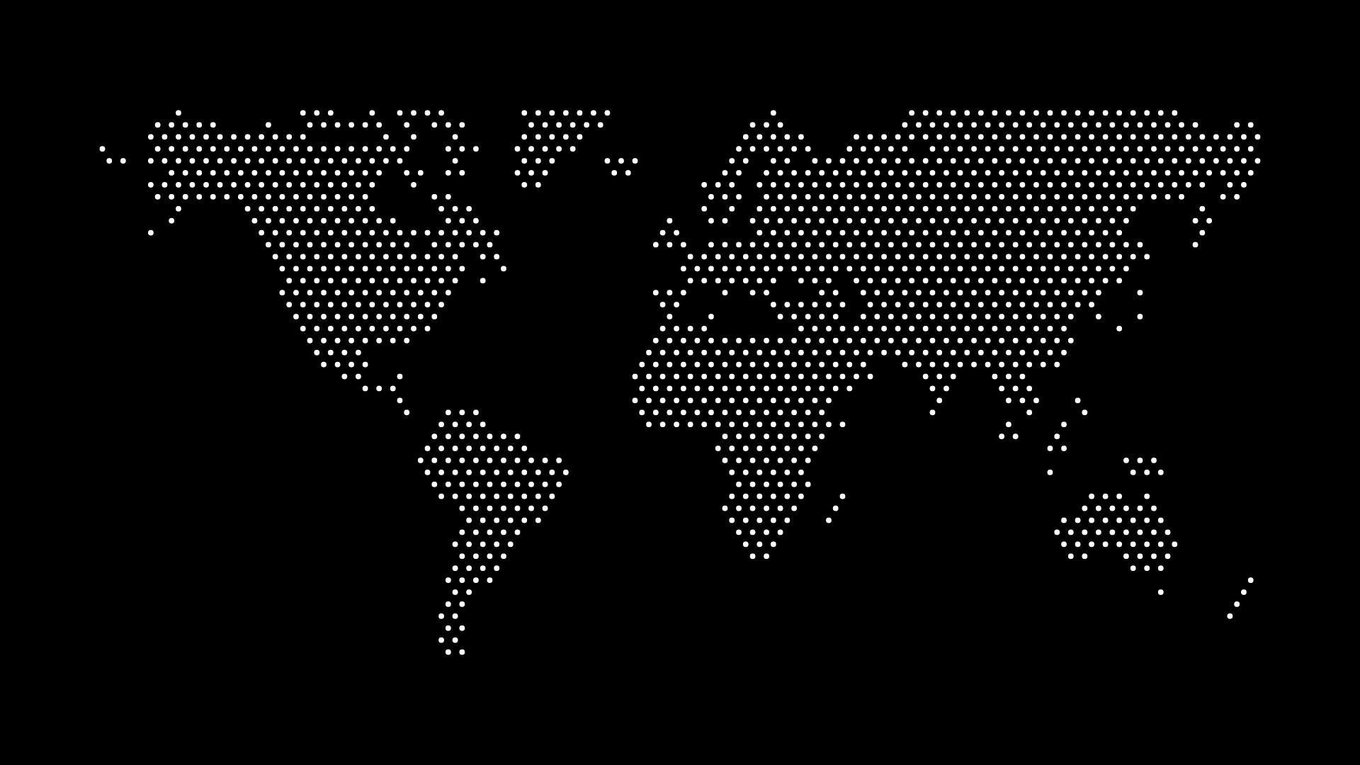
Using a dotted map SVG as a CSS mask lets you reveal a photo, gradient, or solid brand color only through the shape of the map's dots, instead of drawing the dots themselves as visible shapes. It's a different technique from recoloring a map with CSS — a mask controls visibility through a shape, so whatever sits behind the mask (an image, a gradient, a video poster frame) shows through only where the dots are.
This is a good fit when you want the map to feel like it's made of something other than a flat color — a photo texture, an animated gradient, or a brand pattern — without hand-building that effect dot by dot.
The Core CSS
The mask-image property (and its -webkit- prefixed equivalent for Safari) accepts a URL to an SVG, and uses that SVG's alpha channel to determine what's visible:
.map-mask {
  width: 100%;
  aspect-ratio: 2 / 1;
  background: linear-gradient(135deg, #2563eb, #7c3aed);
  -webkit-mask-image: url("/maps/world-dots.svg");
  mask-image: url("/maps/world-dots.svg");
  -webkit-mask-size: contain;
  mask-size: contain;
  -webkit-mask-repeat: no-repeat;
  mask-repeat: no-repeat;
}
Anywhere the SVG has an opaque dot, the gradient shows through. Anywhere the SVG is transparent (the space between dots, and the background if you exported with a transparent background), nothing renders. Swap the background for a background-image pointing at a photo, and the photo shows through the dot shapes instead.
Why Use a Mask Instead of Just Styling the SVG Directly
If you only need a single flat color, styling the SVG's fill directly with CSS — covered in how to customize SVG map colors with CSS — is simpler and has better browser support. Reach for a mask specifically when:
- You want a gradient or animated background to show through the map shape, which a simple
fillcan't do - You want to mask a photograph or texture, not a solid color, into the map's dot pattern
- You're building a hover or scroll effect where the revealed content changes independently of the mask shape itself — for example, cross-fading two background images behind the same static mask
Browser Support and Fallbacks
mask-image has solid support in modern Chrome, Firefox, and Safari, but Safari has historically required the -webkit- prefix even after Chrome and Firefox settled on the unprefixed property — always include both, as in the example above. Older browsers (and some email clients, if you're tempted to reuse this trick there) don't support masking at all.
For anything user-facing that needs to degrade gracefully:
.map-mask {
  background: #2563eb; /* solid fallback color, no mask */
}

@supports (mask-image: url("#")) or (-webkit-mask-image: url("#")) {
  .map-mask {
    background: linear-gradient(135deg, #2563eb, #7c3aed);
    -webkit-mask-image: url("/maps/world-dots.svg");
    mask-image: url("/maps/world-dots.svg");
    -webkit-mask-size: contain;
    mask-size: contain;
  }
}
The @supports block only applies the masked gradient in browsers that can render it, so everyone else just sees a plain solid-color map-shaped block instead of a broken, invisible one.
Performance Notes
A mask-image is a per-pixel compositing operation, and a very high dot-count SVG asks the browser to evaluate a lot of individual shapes. For a hero-section-sized mask:
- Prefer a lower-to-moderate dot density — the visual pattern still reads as a world map, and the browser has less geometry to composite
- Avoid animating the mask's
mask-sizeormask-positionon scroll for large elements if you're also targeting lower-powered devices; masking is more expensive than a simplebackground-positionanimation - If you need the mask to change (a different region highlighted, a different density), regenerate a new SVG rather than trying to manipulate mask geometry with JavaScript at runtime
This overlaps with general SVG performance advice — see optimizing SVG maps for web performance for background on why dot count and path complexity matter beyond just this specific technique.
Where This Shows Up in Practice
- A hero section where a brand gradient is revealed in the shape of a world map instead of sitting behind a separately-colored map graphic
- A team or "our reach" section where a photo of the actual team is masked into a map shape, tying the visual and the message together directly
- A loading or reveal animation, where the mask's
mask-positionanimates a gradient sweeping across the map shape on page load
Because SVG itself is the mechanism here, it's worth being clear on why SVG remains the right format for this kind of technique at all — see why SVG is the best format for web maps for the underlying reasoning if you're deciding between SVG and a raster-based approach.
Generate the Map
Export a moderate-density SVG with a transparent background from the map generator and reference it directly as a mask-image source. If you're also deciding between referencing the SVG as a mask versus embedding it inline for other effects, inline SVG vs. an img tag walks through that broader decision.